Color Psychology in Signage: What Your Palette Says About Your Brand
More Than Just a Pretty Sign
Color plays a critical role in how people perceive your brand—and your signage is no exception. The colors you choose do more than catch the eye; they evoke emotions, shape expectations, and even influence buying decisions.
At Grand River Signs, we design signage that not only looks good but also works smart. Understanding the psychology of color can help you create signs that connect with your audience and strengthen your brand identity.
What Different Colors Communicate
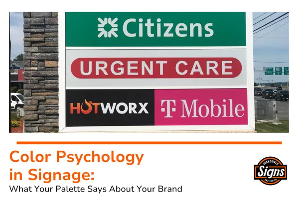
Here’s a look at what some of the most common signage colors typically say to your customers:

🔴 Red
Emotion: Excitement, urgency, passion
Best for: Restaurants, sales promotions, clearance events
🔵 Blue
Emotion: Trust, calm, professionalism
Best for: Financial institutions, healthcare, corporate offices
🟢 Green
Emotion: Growth, health, balance
Best for: Eco-friendly brands, landscaping, wellness centers

🟡 Yellow
Emotion: Optimism, energy, friendliness
Best for: Retail stores, entertainment venues, children’s services
⚫ Black
Emotion: Sophistication, power, luxury
Best for: High-end retail, fashion, tech brands
⚪ White
Emotion: Cleanliness, simplicity, clarity
Best for: Medical facilities, minimalist brands, modern companies

Why Color Matters in Sign Design
When customers encounter your signage, color is one of the first things they notice—and remember. A sign with the right color palette can:
Attract the right customers
Reinforce brand trust and recognition
Drive emotional connections that lead to sales
Meanwhile, mismatched or confusing colors can weaken your brand presence and cause potential customers to overlook you.

How to Choose the Right Colors for Your Signs
Here are a few tips to make sure your color choices work for your brand and audience:
Stay Consistent: Match your signage colors with your overall branding for a cohesive experience.
Prioritize Contrast: High contrast between text and background improves readability at a distance.
Think About Placement: Bright, bold colors pop in busy urban settings, while muted tones may suit professional office environments better.
Consider Your Audience: Younger demographics often respond to bold, energetic colors, while professional or luxury markets may prefer clean, understated palettes.
Partner with Grand River Signs for Color That Connects
We combine color psychology, brand strategy, and expert design to create signage that truly works for you. Whether you need a new storefront sign, directional signage, or a complete branding refresh, we’ll guide you to color choices that speak volumes without saying a word.
Visit grandriversigns.com to learn more or request a free estimate.
Grand River Signs is a custom signage company based in West Michigan, dedicated to helping businesses communicate clearly and grow boldly through high-quality, creative signage solutions.