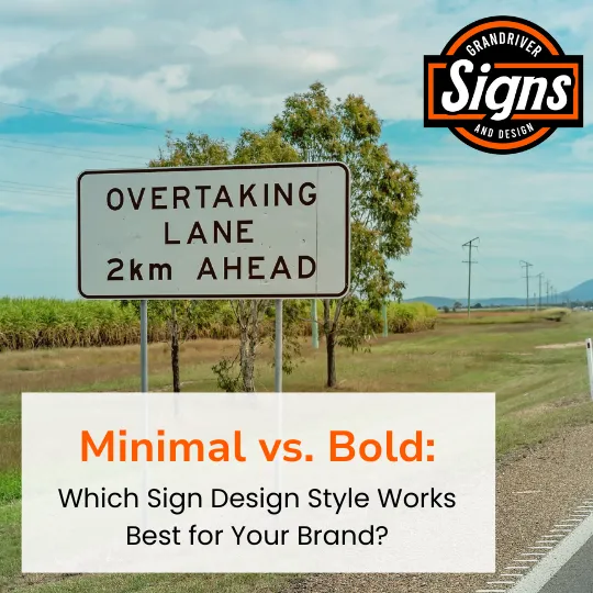
Minimal vs. Bold: Which Sign Design Style Works Best for Your Brand?
Designing Signs with Strategy, Not Just Style
When it comes to sign design, there’s no one-size-fits-all formula. Some brands thrive with clean, minimal signage. Others demand loud, bold designs to grab attention fast. The key is understanding how each style aligns with your brand identity, your audience, and your environment.
At Grand River Signs, we help West Michigan businesses design signage that does more than look good—it works. Let’s break down the difference between minimal and bold sign styles, and when to use each one.

What Is Minimal Signage?
Minimal signage uses a clean layout, limited colors, and lots of white space. It often features simple fonts and icons, and avoids excessive wording or flashy effects.
Best for:
Modern, upscale brands
Healthcare and wellness industries
Offices and tech companies
Wayfinding and internal signage
Pros:
Professional and timeless
Easier readability
Aligns with luxury and modern aesthetics
Cons:
Can be too subtle in high-traffic areas
May not draw immediate attention from a distance

What Is Bold Signage?
Bold signage uses striking colors, strong fonts, and high contrast. It’s designed to be eye-catching, fast to read, and impactful from a distance.
Best for:
Retail stores and restaurants
Event promotions and sales
Vehicle wraps and banners
Exterior signage near busy roads
Pros:
Grabs attention quickly
High visibility day and night
Ideal for high-traffic environments
Cons:
Can look cluttered if overdone
May conflict with minimal brand aesthetics

How to Choose the Right Style
Consider these factors when deciding between minimal and bold:
Brand Personality: Are you more sleek and professional, or vibrant and energetic?
Audience: Do your customers expect clarity and calm or bold and exciting visuals?
Location: Will the sign be read from far away, or up close?
Purpose: Is the sign for branding, wayfinding, or promotion?
The Hybrid Approach
Sometimes, the best approach is a mix of both. For example:
Use bold elements to catch attention (like a headline or logo)
Use minimal layout for supporting details to enhance clarity
This balance ensures your signage is both impactful and easy to digest.
Let’s Design a Sign That Works
Whether your brand calls for sharp simplicity or bold visual impact, we’ll help you create signage that aligns with your goals and your audience.
Visit grandriversigns.com to learn more or request a free estimate.
Grand River Signs is a custom signage company based in West Michigan, dedicated to helping businesses communicate clearly and grow boldly through high-quality, creative signage solutions.