The Psychology of Signage: Colors, Fonts & Design Impact
The Power of Signage Psychology
Signs are more than just visual markers—they are powerful communication tools that influence emotions, perceptions, and behaviors. Understanding the psychology behind colors, fonts, and design can help businesses create signage that attracts attention, conveys the right message, and drives customer action.
At Grand River Signs, we specialize in crafting signs that are not just visually appealing but also strategically designed to maximize impact. Let’s explore how color, typography, and design affect the way people perceive and respond to signage.
The Psychology of Color in Signage

Color is one of the most critical elements of sign design. Different colors evoke different emotions and associations, which can directly influence a customer’s perception of your brand.
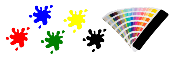
Red – Creates a sense of urgency, passion, and excitement. Often used for sales, fast food, and clearance signs.
Blue – Conveys trust, professionalism, and calmness. Ideal for corporate businesses, financial institutions, and healthcare.
Green – Represents growth, health, and sustainability. Common in eco-friendly businesses and wellness brands.
Yellow – Energizes and grabs attention. Often used for warnings, promotions, or brands that want to convey happiness.
Black & White – Exude sophistication, luxury, and simplicity. Frequently seen in high-end retail and modern branding.
Choosing the right color scheme for your signage is crucial in reinforcing your brand message and influencing customer decisions.
The Role of Fonts in Signage Effectiveness
Typography plays a vital role in how a sign is perceived and read. The right font can enhance readability, evoke emotions, and strengthen brand identity.
Serif Fonts (e.g., Times New Roman, Garamond) – Classic, professional, and trustworthy. Often used for law firms, financial institutions, and luxury brands.
Sans-Serif Fonts (e.g., Helvetica, Arial) – Clean, modern, and highly readable. Perfect for tech companies, healthcare, and minimalist brands.
Script Fonts (e.g., Brush Script, Lobster) – Elegant, creative, and personal. Best used for boutique shops, artistic brands, and invitations.
Bold & Block Fonts (e.g., Impact, Bebas Neue) – Strong, attention-grabbing, and assertive. Common in sports brands, headlines, and promotional signs.
The key to choosing the right font is ensuring clarity and readability from a distance while matching the personality of your brand.
Design Elements That Maximize Signage Impact
Beyond colors and fonts, other design elements contribute to a sign’s effectiveness:
Contrast & Visibility – High contrast between text and background improves readability. For example, black on white or yellow on black.
Simplicity & Clarity – Less is more. Avoid cluttered designs and focus on a clear, concise message.
Size & Placement – Signs should be appropriately sized for visibility and strategically placed for maximum exposure.
Brand Consistency – Ensure your signage aligns with your overall brand identity, including logos, colors, and messaging.
How Grand River Signs Can Help
At Grand River Signs, we understand that effective signage is both an art and a science. Whether you need storefront signs, wayfinding signage, digital signs, or promotional banners, we create custom solutions that make an impact.
Enhance Your Signage Today
Need help designing signage that works? Let’s create something that not only looks great but also drives results.
📞 Call us: 88-614-SIGN (7446)
📧 Email us: [email protected]
🌐 Explore our services: Grand River Signs Website
Your signage is a silent salesperson—make sure it speaks the right message. Let’s build impactful, psychology-driven signs together!


